Founded in 2019, Odeko identified a compelling opportunity to create the most comprehensive small business operations platform on the market. The primary goal was to provide a one-stop shop with the same caliber of tools that are available to industry-leading coffee chains and franchises without losing their local soul. While cultivating fruitful relationships with our first customers and building out solutions to combat their unique pain points, we saw the need to professionalize our brand identity. Odeko enlisted the help of Red Antler, the brilliant agency behind direct-to-consumer brands like Casper, Allbirds & Prose, innovative tech companies like Clear and Hinge, and a partner to giants like Amazon and Google.
Launched in 2007 by Emily Heyward, JB Osborne, and Simon Endres, Red Antler has created visual and strategic identities for some of the world’s most influential brands. What makes Red Antler unique is their ability to leverage the power of social media to create designs and brands that resonate with a millennial audience. By finding the “soul” of each brand they work with, Red Antler crafts trusted brands through great design.
Odeko’s Goals for the Rebrand:
Odeko needed a north star that created focus internally and inspired externally—all in service of uplifting small shops. We wanted to communicate our intuitive and dynamic AI in a way that felt grounded in what it enables as opposed to feeling like a feature competition.
2. Build a recognizable brand
We wanted to prioritize developing a brand world that ladders up to the evolved strategic foundation of our business. This involved highlighting our work in maximizing small businesses in every aspect of their day-to-day tasks without losing the soul of the small business brands that we serve.
3. Highlight our work helping small businesses
Finally, the team wanted to ensure that our new brand resonated with the unique passions, creativity and operations of small food service business owners by showing the human side of small business in a way that is unique to Odeko.
The Process:

The Brand Idea
In order to get to the big brand idea, the strategy included clearly defining Odeko’s offering and how it could alleviate potential customer pain points. Local café and coffee shop owners need support in optimizing all the moving pieces of their businesses, so they don’t have to compromise their vision for their bottom line. What we have defined as Odeko’s product truth is that Odeko is an operations platform that enables small shops to surpass the capabilities of a global franchise without losing their soul. We believe that their small business magic is at the forefront of their success, while we happily help them operate their back-of-house.

Logo Design
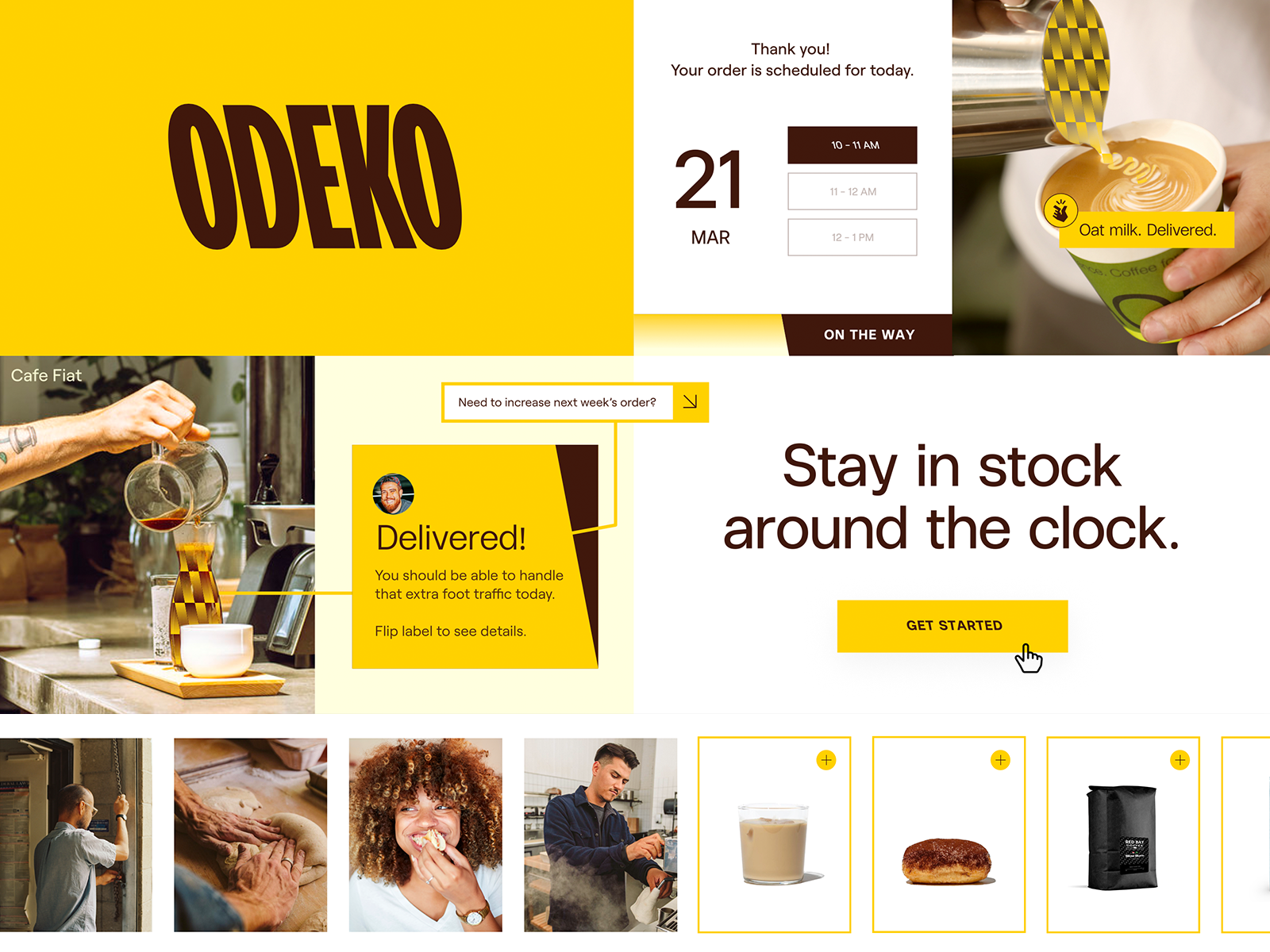
Our wordmark has been crafted to capture the dynamic and bold nature of our brand. It is a distinctive, fast moving all-caps wordmark based on a classic Swiss sans-serif typeface. The customized, condensed characters amplify an exuberant personality. Our wordmark feels energetic, heroic, and holds a strong presence.
![]()
Rebranded Odeko logo (left), Original Odeko logo (right)
Brand Color Palette
We use a single-note palette with a clear approach to warm and rich colors. Our Gold color feels heroic and captures the energy and sentiment of the brand. It is grounded by a deep brown, Mocha, and a neutral Ecru that brings an additional level of sophistication across.
 Rebranded Odeko color palette (left), Original Odeko palette (right)
Graphic Elements
Our snapping fingers graphic represents that moment of instant magic and action of Odeko taking care of things. It adds a cheeky and fun burst of energy and motion into the overall system, while our pattern strategically highlights all the products Odeko can deliver to your doorstep.

Rebranded Odeko graphic elements (left), Original Odeko graphic elements (right)